Rainbow shoelaces
I've always been a big fan of rainbows. But I don't usually like to dress with flashy or bright clothes. I thought a nice pair of rainbow shoelaces would give a subtle-yet-still-colourful fashion accent to go with any of the plain jean/t-shirt combos I usually wear. Initially I figured I'd be able to buy some, but I couldn't find anything good enough...
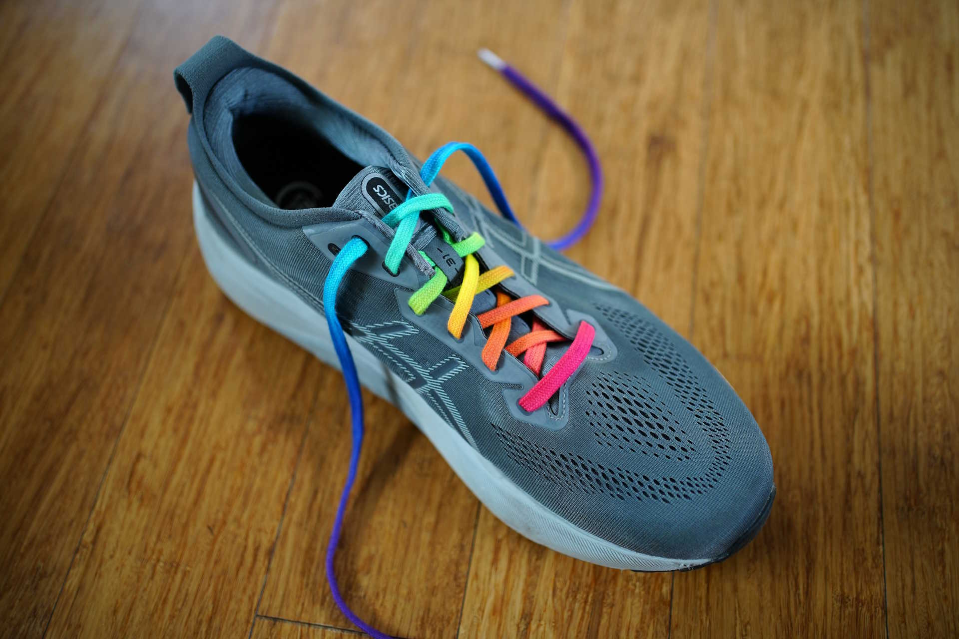
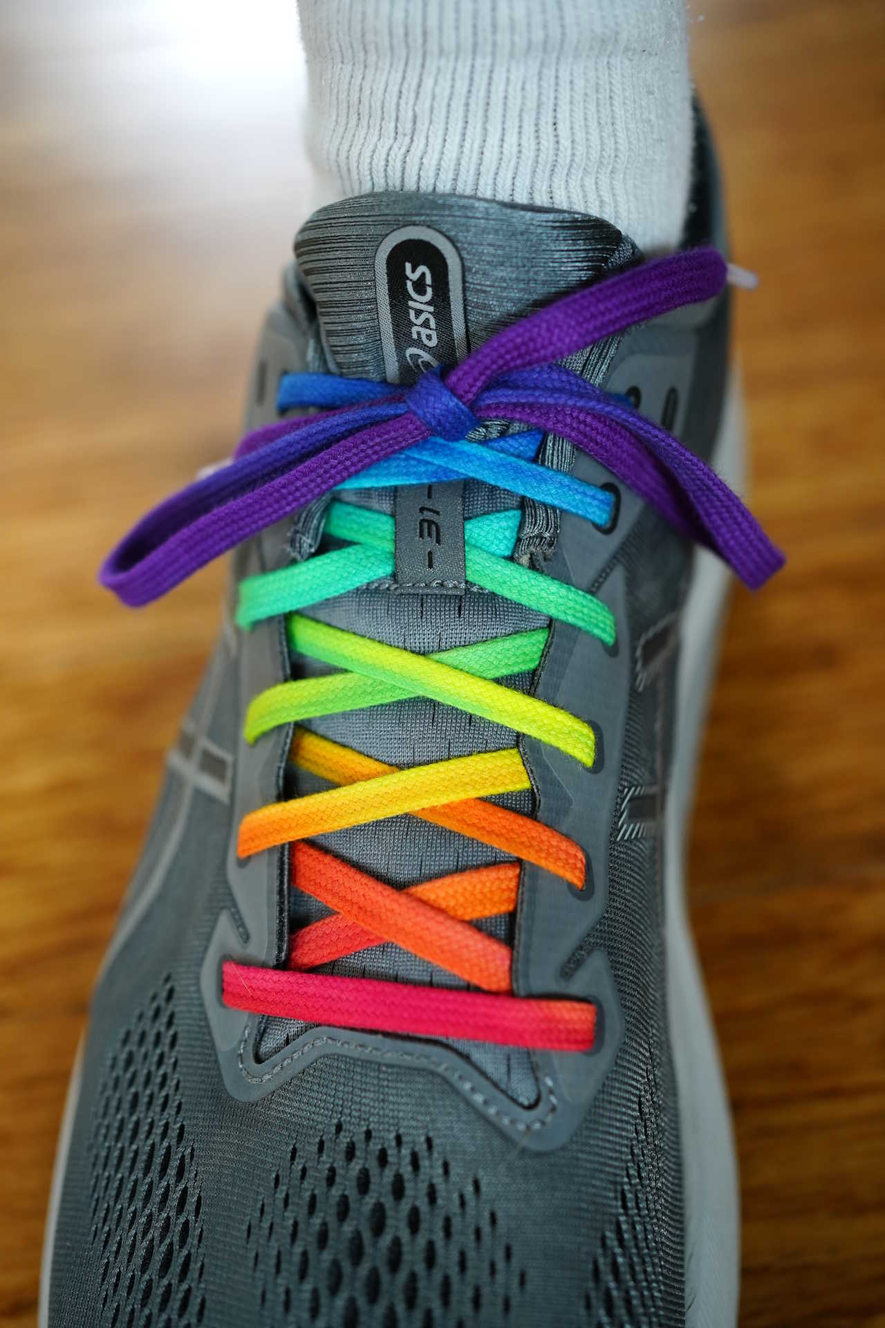
So I embarked on a dye-my-own adventure! Here's what I ended up making:
Starting with the inspiration
I had a rough idea of what I wanted. Something that focused on the colour sequence you get in an actual rainbow. [1]

Last year I was playing around with a hunk of glass to get a good view of the brightest possible versions of those colours. Here's the best setup I could get: [2]
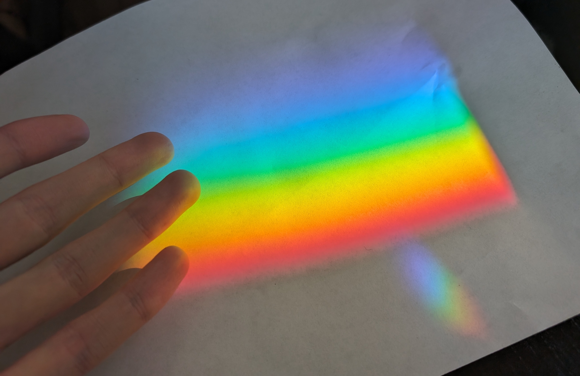
It's a lovely experience to stare at one of these in real life. For most of these colours, we never get a chance to see them any other way. Most are outside the gamut of any computer or phone screen because they're higher-chroma (more vivid and saturated) than what you can produce with an RGB 3-primary colour system. That includes the photo above and all the other ones in this post - I can only show you crude sRGB versions of the more vivid colours you'd see in person. [3]
I don't really know what's so attractive to me about the rainbow pattern, but I would guess it's a combination of factors:
- All the cool science facts about rainbows
- High-intensity/vibrancy
- Adjacent colours never clash
- Maybe our subconscious somehow knows that it's a natural physical arrangement
- Maybe it's a cultural bias I got in childhood from years of indoctrination by Crayola boxes, book illustrations with happy characters frolicking under rainbows, or adults telling me how pretty they are
- The popularity of the rainbow pride flag means that wearing a rainbow also expresses support for LGBTQ people to fight discrimination
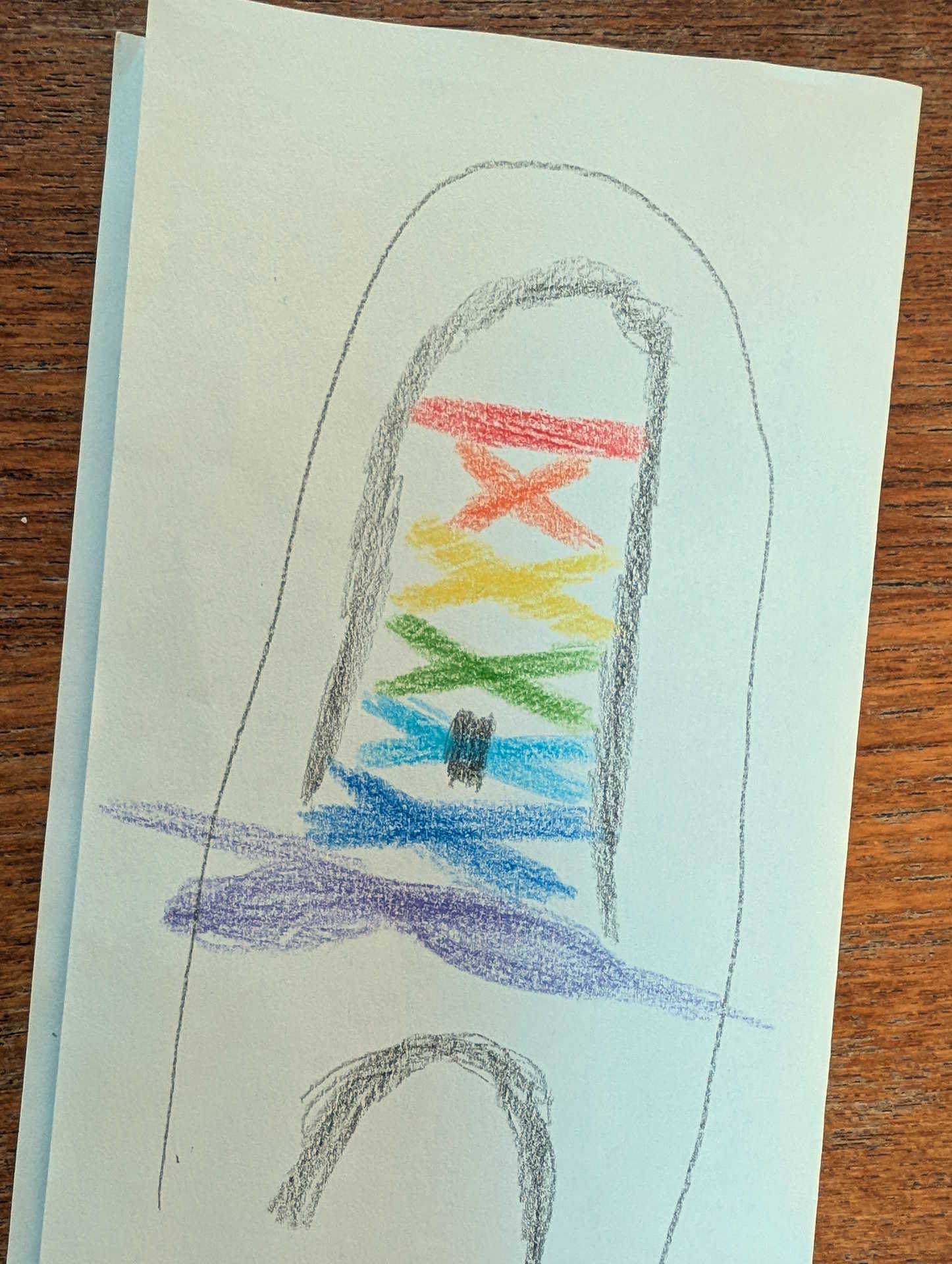
I set my sights on that spectrum of colours, in order by wavelength, and as high-chroma as possible. I figured for simplicity I could find laces with either the full gradient or a handful of respresentative colours, like the 7 that Newton identified using a similar prism setup in his original Opticks:
| red | orange | yellow | green | cyan (blew) | blue (indigo) | violet |
At the time I made a quick sketch of how I'd like the laces to look ideally, with those 7 in wavelength order:
The doomed online search
Initially I thought it would be easy to find what I wanted on the internet. I started with Etsy and Amazon. They were both failures for the same reasons. Here's the Amazon search results page (minus ads) with the first 20 results, to give you some idea of the problem:

- 6 of those don't use rainbow colours at all (like D2) or use rainbow colours that are way too desaturated.
- 7 come with a pattern that's vaguely rainbowish when the lace is laid out in a straight line (like option D1). But it seems the designers either forgot that laces tend to be tied in a distinctly not-straight-line pattern or thought the buyers wouldn't mind if the order and positions of the colours got all jumbled up.
-
5 have the colours stacked across the width of the lace (like option A4).
I have pretty good vision, but even for me it would be difficult to see the individual colours well on my shoes when I'm standing up.
Another problem is that lots of them are based on the pride flag.
Obviously the rainbow flag is hugely successful.
But if you judge it as a representation of rainbow colours, I'd say it fares poorly:
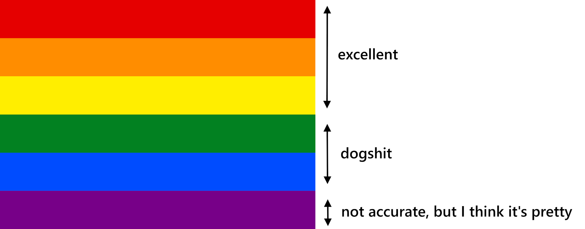 The main problem isn't the blue and green themselves, through the green is strangely dark.
The main problem is the wide gulf of important colours that are skipped:
[4]
The main problem isn't the blue and green themselves, through the green is strangely dark.
The main problem is the wide gulf of important colours that are skipped:
[4]
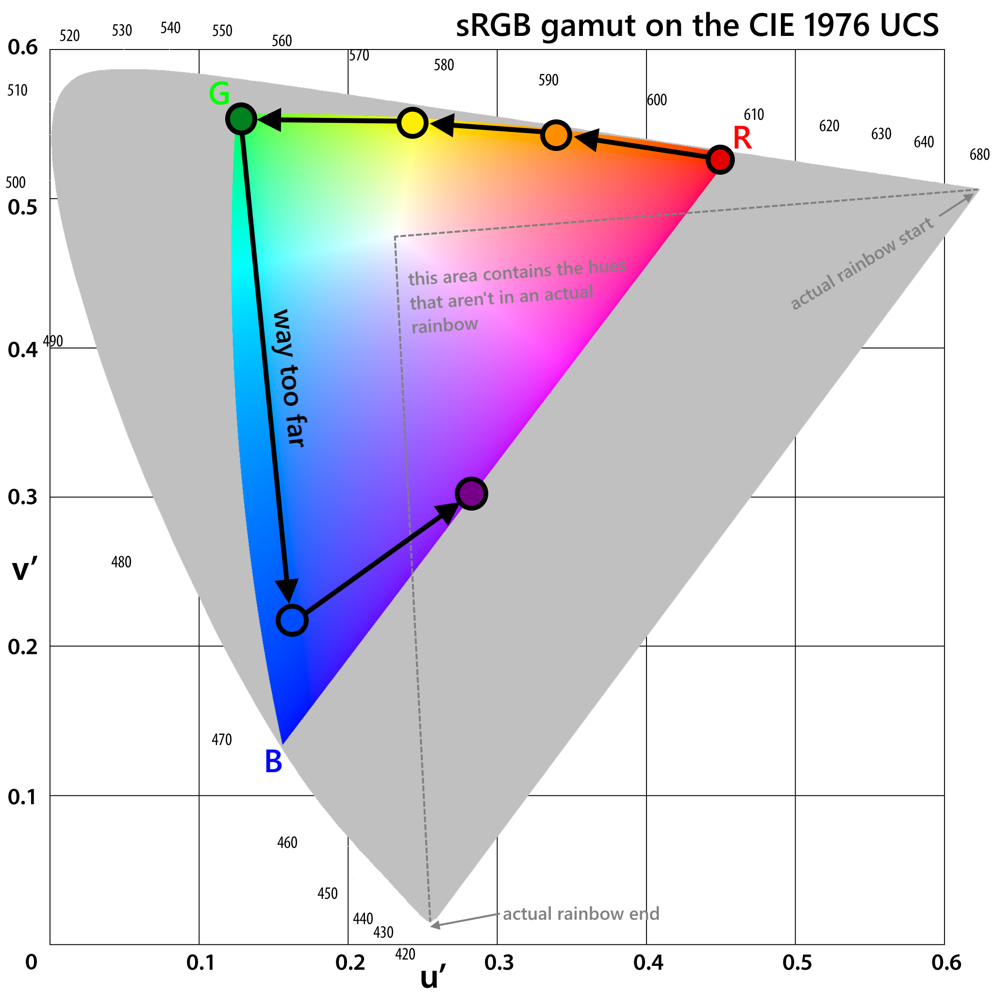
Where are the cool greens, like jade and sea green? How about teals, turquoises, aqua, cyan, baby blue, sky blue, azure, etc? I realize there's value in simplicity, but it's ridiculous to jump all the way from forest green to a deep blue without picking even one colour in-between. [5]
With nothing appealing online, it seemed like if I wanted a realistic range of visible raibow colours in the right order, I'd need to do it myself.
Dyeing my own
I settled on a sodium carbonate tie dye set with 12 colours including a good range of blue-greens. I used 55" laces made from cotton. Synthetic fibers wouldn't work because the pigments need to literally bond with cellulose so they don't wash out.
I mixed the dyes on my balcony on a plastic sheet.
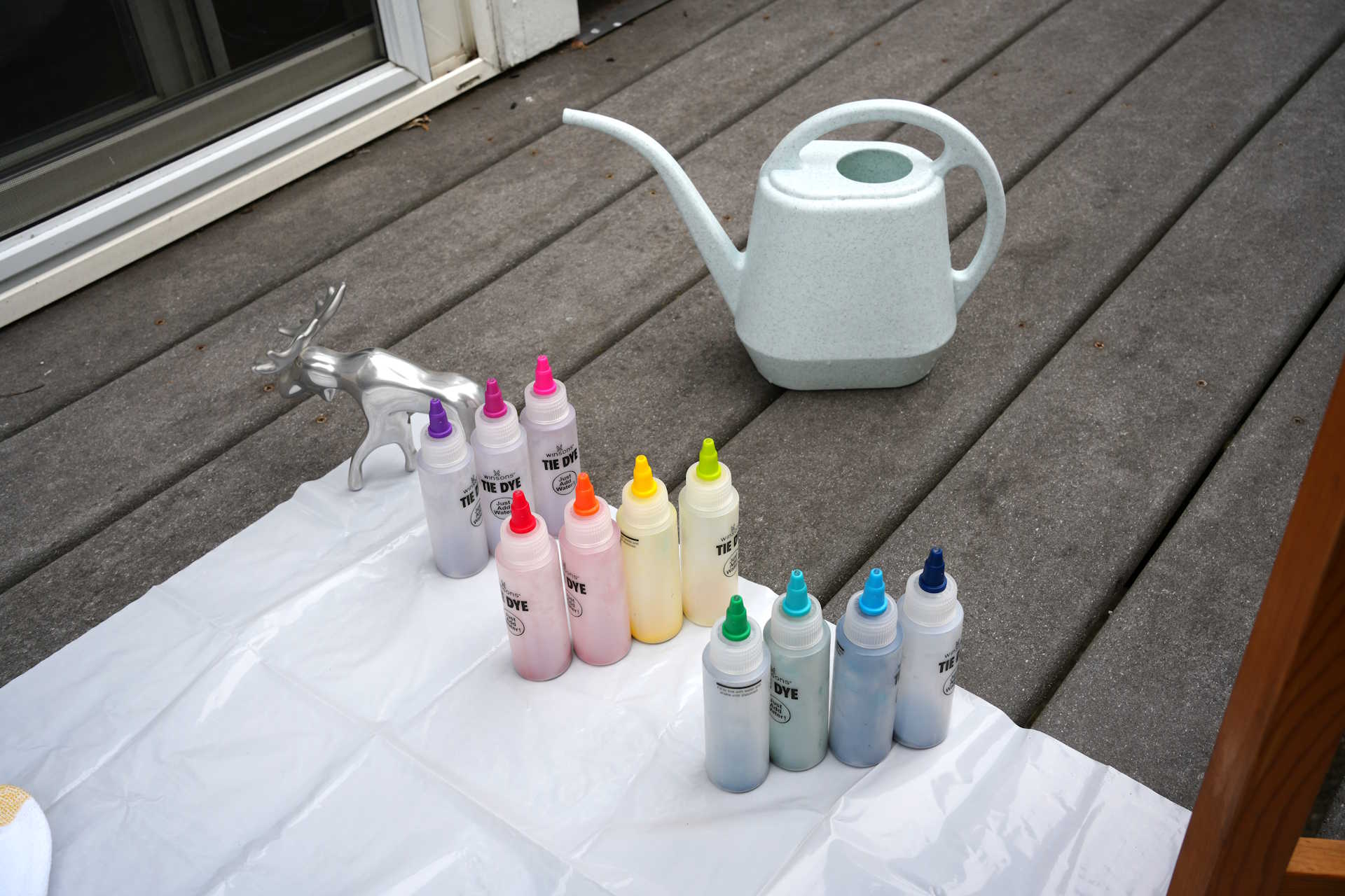
The first step was to test each colour with a drop on a sock.
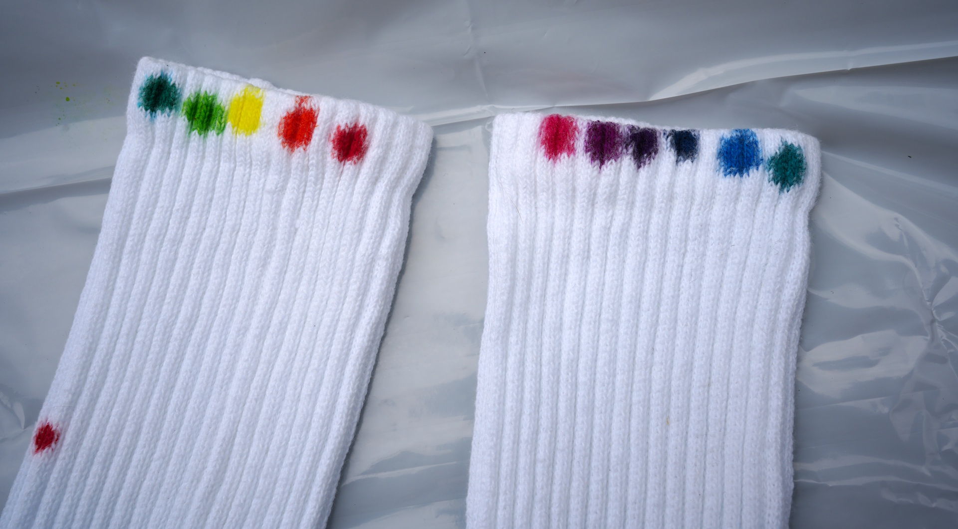
Based on the test, I chose 8 of the 12 colours: red, orange, yellow, pale green, green (which to me looked more teal), turquoise (to my eye more like cerulean, a deep sky blue), blue (the very dark-looking one on the sock), and purple. An errant red spot got on the shin accidentally, so now it looks like I'm bleeding when I wear it.
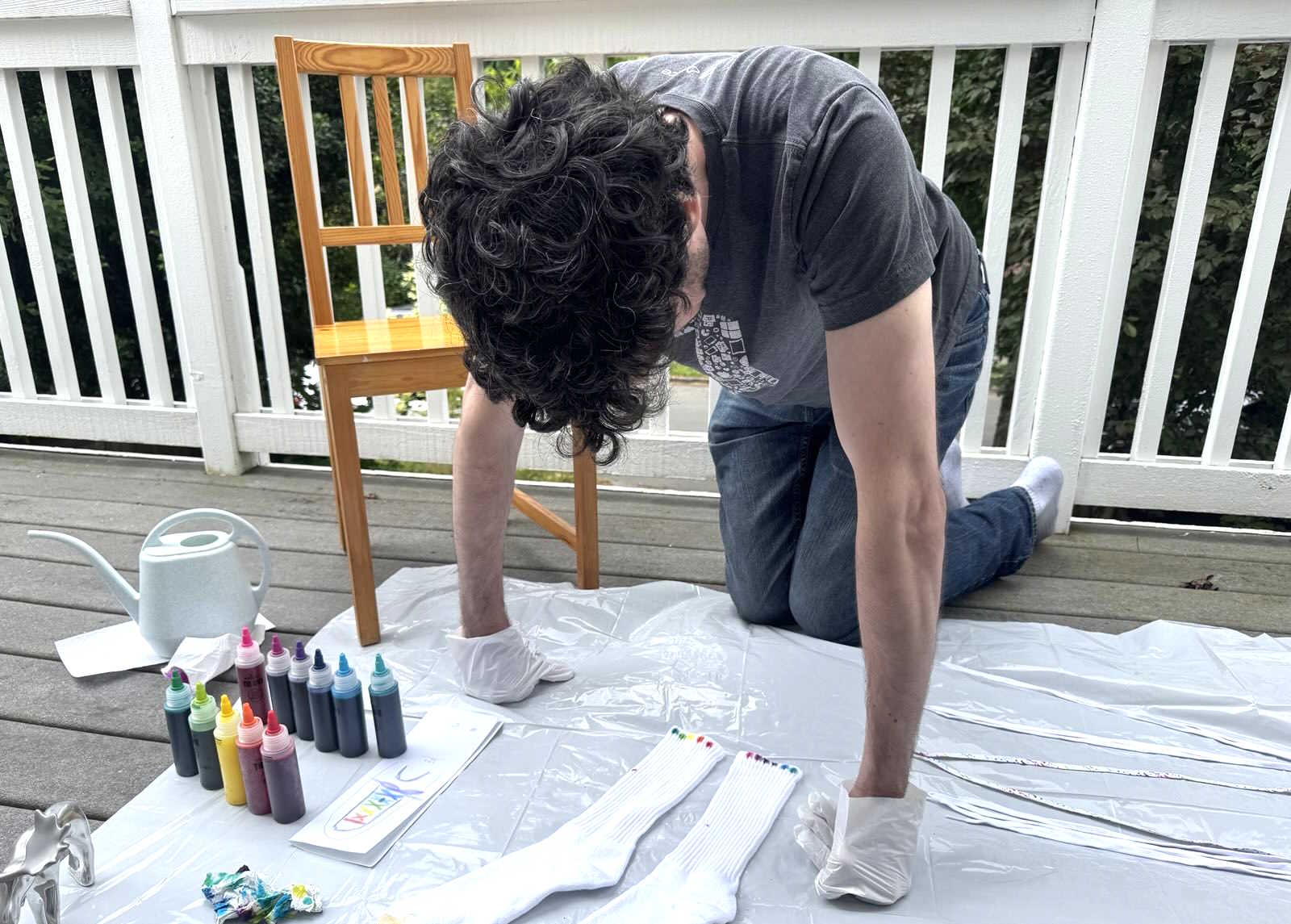
I washed the laces but let them air-dry to make sure they still had some water content during dyeing to avoid uneven die application. Dyeing guides recommended between 110% and 130% of the cotton's dry weight. I started mixing the dyes when the laces got down to around 120% of dry weight. I was worried because the laces were only at 110% of dry weight by the time I started the actual dyeing, but I think this moisture level ended up being ideal.
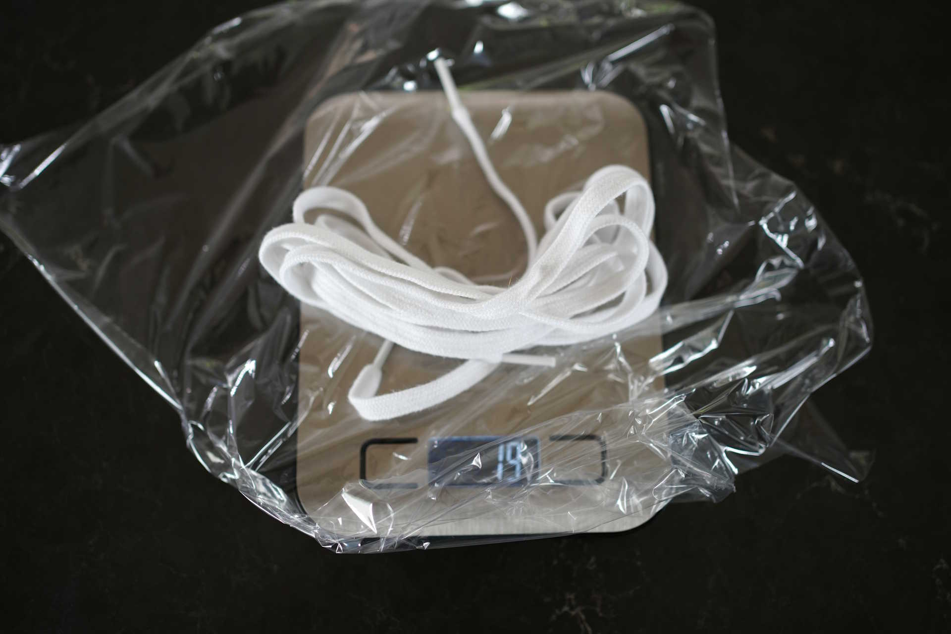
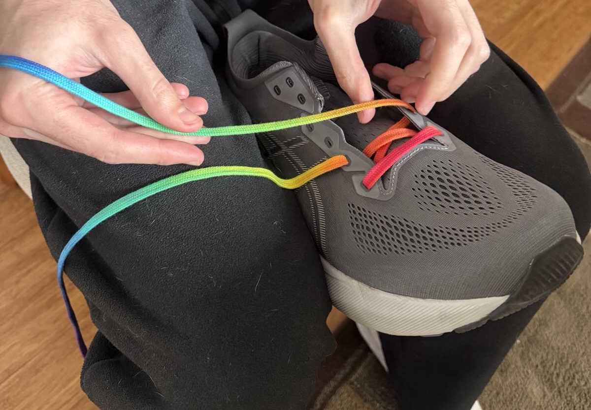
I placed droplets of die directly onto the laces, starting with red. Because I wanted the colours to match all the way up the shoe (unlike the laces available online), I needed to place the colours symetrically, with red in the middle and two mirrored strips of each other colour. I had previously threaded a test template lace in my shoe and marked the location of each eye with pen to indicate where each colour needed to start.
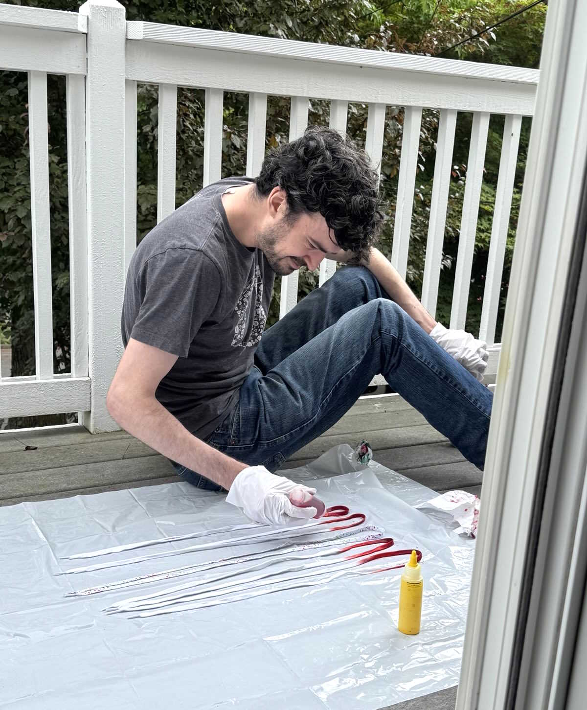
Because I needed to completely saturate the laces with dye, the colours bled into each other more than I'd planned, especially on the bottom surface touching the plastic. The blending created a beautiful smooth gradient, but lighter colours like yellow seemed slightly overpowered from adjacent darker colours creeping in. I limited the bleeding by soaking up excess dye underneath the laces with a paper towel every couple minutes. The next time I dye a rainbow I'll leave more room for the yellow and cyan areas.
I wrapped the laces in the plastic to keep them wet for around 7 hours while I waited for the dye to bond.
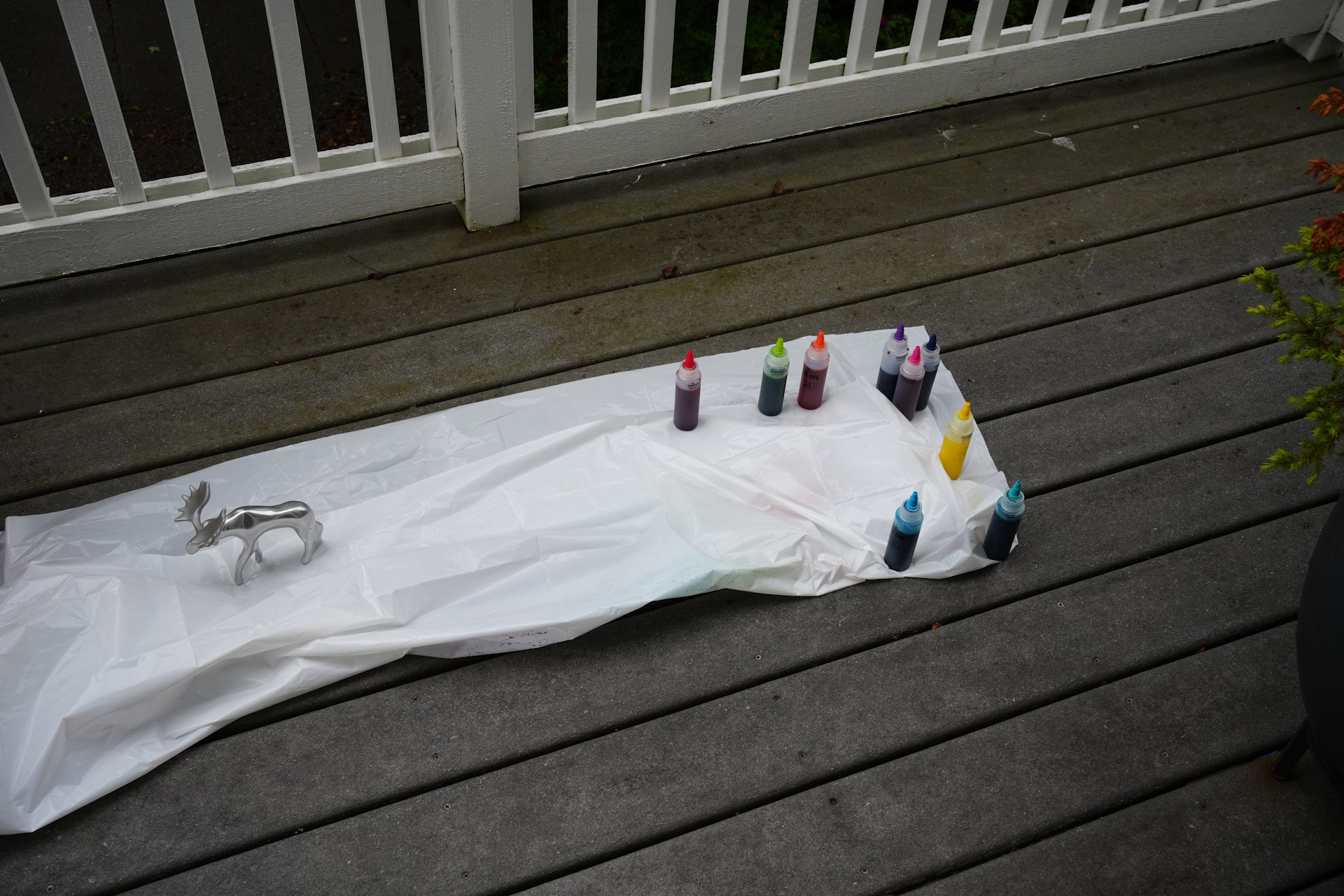
Then I washed them with hot water and dish soap in the bathtub. It took around 20 minutes of rinsing until I couldn't see any more dye come out. I let them dry overnight on a hanger.
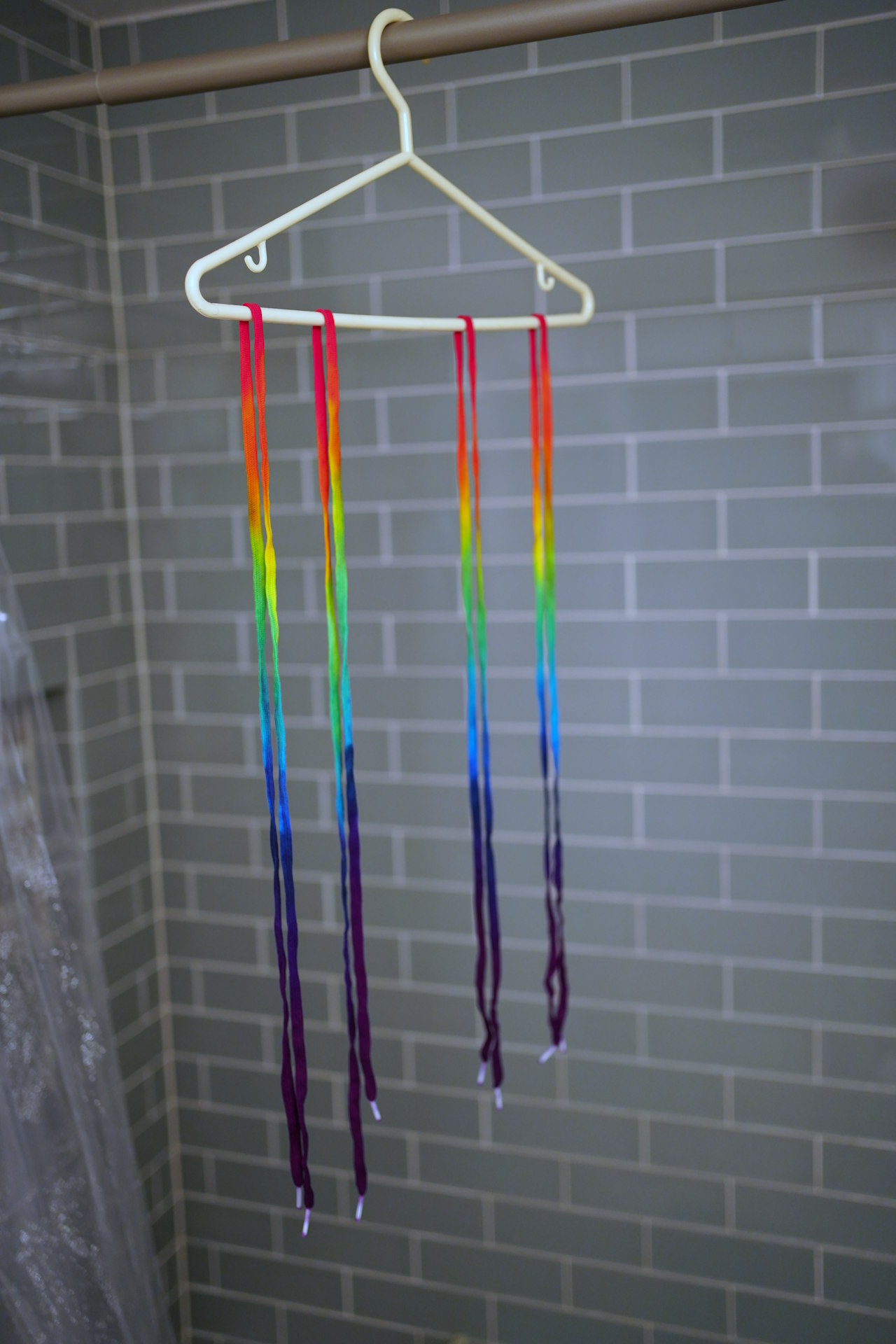
Seeing the laces in the morning, I was much happier with the amount of yellow visible. I was worried the green would be visible all the way through to the orange, but I was pleasantly surprised at the result once it was dry.
Project assessment
I'm really happy with the laces. It wasn't much work (apart from the research) and only cost around $25 all in for two pairs. I've worn them for a week or two and they've held up well so far. I've noticed my pants cover most of the bowtie, so there's not a ton of blue visible on my foot. I'm also not sure about the longevity of the cotton laces - it feels like they might not last as long as synthetic ones. Finally, I learned a lot more about colour spaces and color science!
If I was redoing the project I'd dye smaller areas of red and orange, to give more space for the yellow, and I'd probably omit purple in favour of more blue. Before applying the dye, I'd also add paper towel pieces at regular intervals underneath the laces to help control bleeding.
Overall, the rainbow shoelaces get a 9/10 project score.
Footnotes
- I actually only learned last year how rainbows work! Before then, all I could tell you was that the water droplets act like prisms, refracting parallel rays from the sun into slightly different directions depending on the wavelength of the light. Each visible wavelength gives you the sensation of a different colour in the spectrum. But then I read a couple Wikipedia articles and watched some good videos: if you have 4 minutes you can find out how rainbows really work with this great video from Physics Girl (or spend 30 minutes watching Veritasium do a live demo).
-
For anyone who wants to produce their own visible spectrum, I have a few tips:
- Your prism should be heavy, clear glass, either a triangular prism shape or rectangular, like a cube. Bigger is better.
- Find a window that's getting direct sunlight on a clear day. It must be sunlight because it must be collimated and broad-spectrum.
- Block out as much of the light in the room as possible, including the window that's getting sun, all other windows, and indoor lighting.
- Leave a small hole uncovered for the sun to shine through.
- Hold your prism in the sunbeam and rotate it to find the best orientation.
- Direct the best spectrum onto a white surface in the dark room, like a piece of paper.
- Synthetic and natural pigments like ultramarine can have beautiful colours, but most aren't extremely vivid and there are big gaps in hue without accessible vivid pigments, especially around the greens and blues. For example, spectrophotometer readings for dozens of common paint pigments show that high-chroma paints are quite rare. There are only a handful of ways to witness those strong colours. Laser shows can show you some. In the same vein, I'm envious of the handful of test subjects who were able to experience a new colour, "Olo", that's even more vivid than a maximum-chroma colour.
-
This chart is based on CIELUV, some math and science from the 1970s that tries to map colors in a way that's perceptually uniform.
That means the distance between colours on the chart is supposed to indicate how similar the average human perceives them to be.
I changed all non-sRGB colours (ones you can't see on a screen) to gray and added 6 indicators with the colours the pride flag chose.
As you can see, there are 4 colours on the red/green axis but only two on the green/blue axis. So if you're limited to only 6 colours for a rainbow, you'd get a more even distribution by skipping orange and just using red, yellow, green, cyan, blue, and violet. -
Interestingly, Gilbert Baker, the creator of the gay pride flag, originally designed it with two additional colours, pink and a colour he called turquoise):
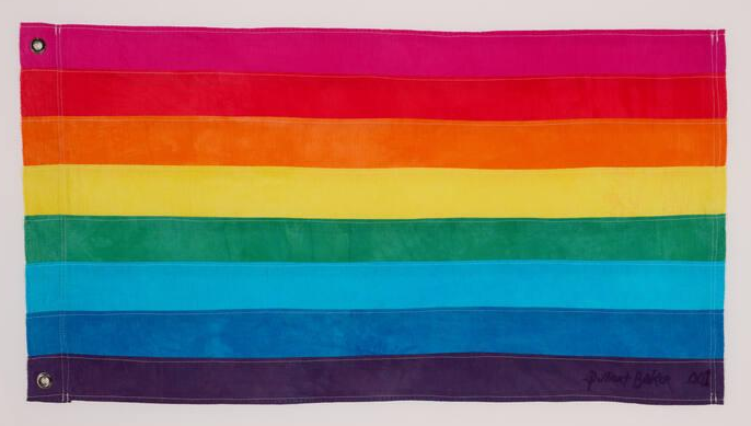
To me this one looks way better. Apparently, the pink was removed because the creator ran out of pink dye. The turquoise was removed the following year to split the flag evenly in half for a parade. The Wikipedia page for the rainbow flag appears to have the wrong colours in its picture of the original flag, especially the second-last colour which is totally different: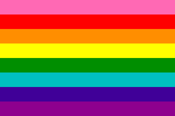
I suspect that's because Baker described the second-last colour as indigo. For hundreds of years, that word mostly described the colour you see above on the real flag (after the ancient indigo dye, a deep blue similar to cobalt and the blue LEDs we use in our screens). But 8 years later in 1976, some techies without much background in colour or linguistics created the rgb.txt file with English names for 69 colours that were later used in the original HTML color spec. So now whenever someone types "indigo" in a CSS page, a shade of violet shows up instead. That appears to be what the Wikipedia editor did as well, rather than using photos of the actual flag. If you google "indigo color" now, you'll see more purples than the blue that it originally meant. Tragically, Newton himself used the word indigo in his 1704 Opticks. That means the ROYGBIV acronym we all learn in elementary school is likely doomed to confuse kids for decades. Ultimately I blame English for having only one basic word blue to describe colors ranging from cyan to indigo, unlike Russian and Italian, which have two. I advise you to never use the colour name indigo, lest Gilbert Baker's fate befall you.
Comments
Leave a Comment